B2B SaaS Funnel Conversion Benchmarks (and Why They Don't Explain Your Revenue)
B2B SaaS funnel conversion benchmarks are easy to find. Visitor-to-lead, lead-to-MQL, MQL-to-SQL — the ranges exist, and most teams know roughly where they stand.
Here are the commonly cited numbers. Use them as orientation, not diagnosis.
B2B SaaS Funnel Conversion Benchmarks by Stage
The ranges below reflect commonly cited benchmarks across B2B SaaS literature. Actual results vary significantly by GTM model, ACV, lead definition, and sales cycle length — treat these as directional, not universal.
| Funnel Stage | Commonly Cited Range | What Moves This |
|---|---|---|
| Visitor → Lead | 1–3% | Traffic quality, landing page |
| Lead → MQL | 15–40% | ICP fit, lead scoring |
| MQL → SQL | 13–21% | Sales speed, qualification criteria |
| SQL → Opportunity | 30–50% | Discovery quality, ICP match |
| Opportunity → Closed Won | 20–25% | Deal dynamics, competitive context |
| Overall Lead → Customer | 2–5% | Everything above, compounded |
Sources: First Page Sage; Prospeo. Aggregated industry benchmarks. Ranges simplified and normalized for comparison.
Your Dashboard Is Green. Revenue Isn't Moving.
Benchmarks live in their own lane. Visitor-to-lead is a traffic metric. MQL-to-SQL is a qualification metric. Each one tells you something about its own stage — and nothing about what happens between them.
Where exactly revenue leaks across those stages — I covered in B2B SaaS Sales Funnel: Why Leads Aren't Turning Into Revenue.
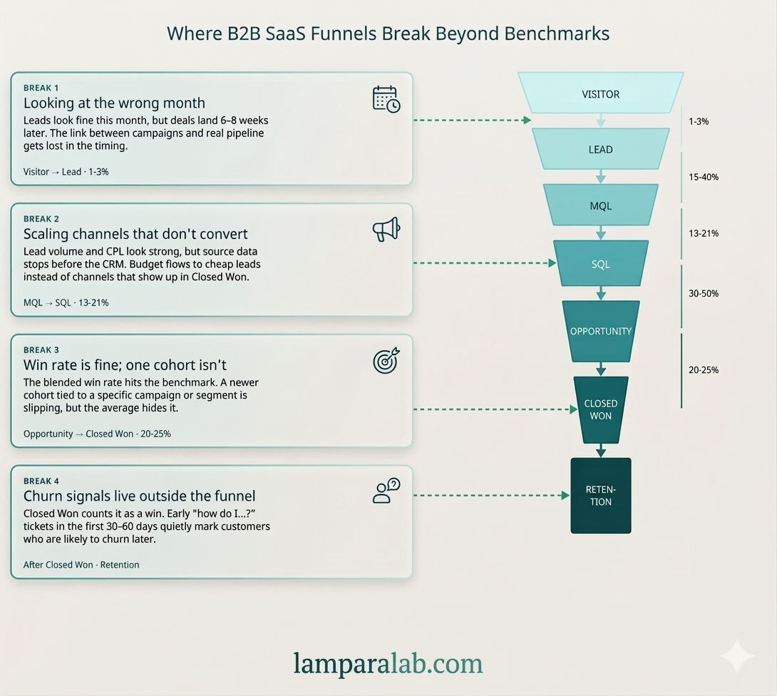
This piece is about something different: what happens when the stages look fine individually, but revenue still doesn't follow. Four patterns. None of them show up in a standard dashboard.
- Break 1 — Wrong time window: campaign results and revenue never connect
- Break 2 — Leads ≠ revenue: most leads come from your worst channel
- Break 3 — Averages hide the dip: one cohort is failing while totals look fine
- Break 4 — Churn was predictable: warning signal appears weeks before you see it
Break 1: You're Measuring Channels in the Wrong Month
Visitor → Lead → MQL: directional benchmark 1–3% / 15–40%
Visitor-to-lead and lead-to-MQL look fine. The problem isn't the rate — it's when you're measuring it. If your sales cycle is 6–8 weeks, evaluating a channel by how many leads it brought this month is a structural mistake. You're always looking at the wrong time window.
The right question isn't "how many leads did paid bring in January." It's "the leads that became MQLs in March — where did they come from in January."
| Week | Organic Sessions | Paid Sessions | MQL Volume (+6 Weeks) |
|---|---|---|---|
| Jan W1 | +40% | +40% | Organic: +38% / Paid: +4% |
Illustrative example — directional pattern, not a specific dataset
Same traffic spike. Opposite result six weeks later. Paid brought people who looked like leads but didn't convert. That's either the wrong audience, the wrong message, or both.
The benchmark doesn't tell you if the traffic behind that rate is qualified or not. A healthy visitor-to-lead rate looks the same whether your paid channel is bringing the right people or the wrong ones. You only see the difference six weeks later — when MQLs either show up or don't.
→ Before scaling any channel, build this table offset by your sales cycle length. No downstream correlation means no evidence the channel is working.
Break 2: Your Biggest Channel Is Probably Your Least Profitable One
MQL → SQL → Opportunity: directional benchmark 13–21% / 30–50%
MQL-to-SQL looks reasonable. But that rate is blended across all channels — and you almost certainly don't know which channel is producing the SQLs that actually close.
CPL — cost per lead — is a vanity metric in B2B SaaS. A channel that brings cheap leads with a low win rate often costs more than a channel that brings fewer, more expensive leads that actually close. But the comparison can't be made if UTM data never makes it into the CRM.
| Source | Leads | Win Rate | Avg Deal | Revenue |
|---|---|---|---|---|
| Organic | 40 | 24% | $11K | $105K |
| Paid | 95 | 4% | $5K | $19K |
| Referral | 18 | 38% | $14K | $96K |
Illustrative example — numbers are directional, not from a specific dataset
The pattern this illustrates: high lead volume from one channel doesn't mean high revenue from that channel. In many benchmark datasets, organic and referral leads often convert at higher rates than paid — though this varies significantly by company, ACV, and GTM model.
MQL-to-SQL looks fine in aggregate. But that number is blended across all your channels — and the spread between them is almost always much wider than the average suggests. The benchmark shows you the blend. It doesn't show you which channel is dragging it down.
This doesn't mean "turn off paid." It means you don't have the data to make that decision — and you're probably scaling the wrong thing.
→ One fix: make sure UTM source gets saved on the contact record in your CRM when a lead fills out a form. Without that, this table stays empty permanently. If this is the gap you're at, this is usually where the analysis needs to start — looking at marketing data and CRM together, not separately. That's the starting point of the revenue diagnostic at LamparaLab.
Break 3: Your Win Rate Looks Fine. One Slice of It Isn't.
SQL → Opportunity → Closed Won: directional benchmark 30–50% / 20–25%
The overall Opportunity-to-Closed Won rate sits in the normal range. But that number is an average across everything — and averages hide the moment something actually broke.
Your company changes fast — new channel, new pricing, new sales rep, new ICP. Each of those changes shows up in specific groups of deals. But when you look at the total win rate, all those changes blend together and disappear.
The fix is simple: instead of looking at win rate overall, look at win rate for leads that came in 90 days ago as a separate group. That's a cohort — a specific batch of deals you can track independently.
- Aggregate win rate: 21% — looks fine.
- Q3 cohort (leads from Jul–Sep): 28%.
- Q4 cohort (leads from Oct–Dec): 11%.
What changed in Q4? A new paid channel launched in October.
The overall number looked completely normal while one cohort was quietly failing for three months.
A win rate inside the benchmark range can contain a strong cohort and a failing one at the same time. The benchmark has no way to show you which one is your current reality.
Overall metrics hide the moment something broke. Looking at a specific cohort shows you exactly when it happened — and gives you a chance to act before it becomes a trend.
→ Once a quarter: check win rate for leads created 90 days ago as a separate group, not as part of the rolling total. That's the only way to catch a problem before it compounds.
Break 4: The Customers Who Will Churn Are Already In Your Support Queue
After Closed Won: the funnel doesn't end at the signature
The deal closed. By the benchmark, it's a win. But the funnel doesn't end at the signature — and churn in B2B SaaS rarely happens suddenly. It's almost always predictable from what a customer does in their first 30–60 days. That signal lives in your support system — and nobody looks at it as a funnel metric.
The pattern: customers who open a lot of "how do I" support tickets in month one churn at month three at a much higher rate than customers who don't.
| Support Tickets in First 30 Days | 90-Day Churn Rate |
|---|---|
| 0–2 tickets | ~8% |
| 5+ tickets | ~34% |
Illustrative pattern — directional ranges, not a universal dataset
That's not a support problem. It's a signal that you either sold to the wrong person — or didn't get them to their first win fast enough.
Closed Won is where the benchmark ends. But a deal that closes and churns in 90 days isn't a win — it's a delayed loss. The benchmark doesn't track what happens next.
If you see this pattern, there are two hypotheses. Either the ICP is wrong and you're selling to people who aren't ready for the product. Or onboarding isn't working and customers don't reach value before they give up. Both start not in support — but in the funnel.
→ Match support tickets to the deals closed in the same period. If the pattern holds, the next question isn't "how do we fix support" — it's "who are we selling to in this cohort and where did they come from."
Four Breaks, One Problem
The breaks aren't independent. They chain.
-
1
You can't see which channel produces revenue
Because you're measuring it in the wrong month.
-
2
You can't fix the measurement
Because UTM data never made it into your CRM.
-
3
You can't tell when something started going wrong
Because you're looking at averages that flatten the signal.
-
4
By the time churn shows up in your numbers
The decision that caused it is already 60 days in the past.
Each break makes the next one harder to see. That's why the funnel can look completely healthy while revenue stays flat.
If Your Numbers Look Fine But Revenue Isn't Following
The break is almost always in how these pieces connect — across time, channels, and data sources that were never designed to talk to each other.
At LamparaLab, I work inside your marketing analytics, CRM, and pipeline data to find where that connection breaks. Not a dashboard. Not a report template. A real look at what your specific data is — and isn't — telling you.
See how the revenue diagnostic works →
Frequently Asked Questions
What is a good conversion rate for a B2B SaaS funnel?
There's no single answer — it depends on your sales motion, ICP, ACV, and channel mix. Commonly cited directional ranges: visitor-to-lead at 1–3%, MQL-to-SQL at 13–21%, SQL-to-Opportunity at 30–50%, Opportunity-to-Closed Won at 20–25%, and overall lead-to-customer at 2–5%. Definitions vary across companies — what one team calls an MQL another might call a lead, which shifts every downstream number. The more useful question isn't whether you're hitting the benchmark — it's whether your conversion rate is stable or drifting, and what changed when it did.
Why is my B2B SaaS funnel not converting despite good metrics?
Usually because the metrics you're tracking are each accurate — but measured separately. MQL rate, win rate, and pipeline volume are all real numbers. What they don't show is whether the leads converting to MQL are coming from channels that actually close, whether your win rate is consistent across different time periods, or whether the customers you're closing are staying. The issue isn't bad data. It's an incomplete picture.
What is the average MQL to SQL conversion rate in B2B SaaS?
Commonly cited ranges sit between 13–21%, though some sources report higher or lower depending on how MQL and SQL are defined. The more important variable is often the channel: in many benchmark datasets, organic-sourced leads tend to convert at higher rates through this stage than paid search leads, though the gap varies significantly by company and GTM model. If your blended rate looks fine but you're running mostly paid, it's worth breaking the number down by source before drawing conclusions.
How do I know which marketing channel actually drives B2B revenue?
Connect UTM source to your CRM: capture the channel on the contact record when a lead fills out a form, then report on win rate and average deal size by channel — not just lead volume. In many cases, the channel generating the most leads is not the channel generating the most revenue. The data is usually already there. The connection just hasn't been made.
What causes B2B SaaS churn in the first 90 days?
Two common patterns. First, onboarding failure — customers didn't reach value fast enough, which often shows up as high "how do I" ticket volume in the first 30 days. Second, ICP mismatch — the customer was closed but wasn't actually a good fit for the product, often traceable to a specific acquisition campaign or channel. "This isn't what I expected" is the support ticket phrase that frequently signals the second pattern.
How do I run cohort analysis for B2B SaaS without full user tracking?
You don't need user-level tracking. Use lead creation date as your cohort anchor: group leads by the month they entered your CRM, then track that group's win rate, deal size, and 90-day churn rate separately. Compare those groups over time instead of looking at rolling totals. That's usually enough to surface changes that the aggregate number hides — a new channel launch, a pricing change, a shift in who you were targeting.
About the author

Anna Orestova
Revenue Analytics Consultant · Founder, LamparaLab
Hi, I'm Ana. I work with B2B founders to understand what is actually happening in their data — and why revenue doesn't grow the way it should. With a background in finance and several years in B2B SaaS (mostly FinTech, US market), I focus on connecting marketing, CRM, and pipeline data to find where things break.
LinkedInYour benchmarks look fine. Let's find out why revenue doesn't follow.
I look at what's happening across time, channels, and data sources that were never designed to talk to each other. The goal is to find where the connection breaks — and what to fix first.
Book a Call